1. Use strong visuals
The image on your product page visually communicates the details of your product to visitors. One of the main best practices for e-commerce product pages is to use a high-resolution, zoomable image above the fold. Multiple images from different angles can help customers answer product-related questions.
Remember that customers can’t touch or feel your product and a demo video is one of your best bets for displaying it in all its glory. Think of your PDP as a virtual shop window – the clearer and more enticing the display, the more likely shoppers are to step inside. When someone moves page to page within a site, they expect pages to look and feel consistent.
Shopify Editions has introduced a suite of AI tools under the name Shopify Magic. In addition to the text generator for product descriptions and AI chatbots, now you can also make use of the media editor. With this feature, merchants can effortlessly adjust photo backgrounds without the need for Photoshop skills, ensuring their images align perfectly with their desired theme.
Simon (Customer Success Manager): "Getting to see a product in use (either through a brand photo or UGC) helps potential buyers get a better understanding of how the product looks and behaves in use, which in return reduces return rates and increases the conversion rate. On top of that, UGC variation offers a social proof aspect for indecisive buyers."
Roy (Frontend Developer): "Keep the look and feel of the product page and site-wide navigation consistent so that users always know where they are."
.png?width=2000&name=PDP-1-stoov%20(1).png)
2. Add a prominent call to action
A well-placed CTA can make the difference between a lost sale and a happy customer. "Tell your visitors exactly what you want them to do on the PDP page", emphasizes frontend developer Sabine.
Take, for instance, Farmer Gracy's product page, where the CTA is prominently displayed and easily recognizable. Additionally, the pop-up notification highlighting recent purchases from nearby locations further incentivizes visitors to take action.
.png)
.png)
3. Write a complete product description
Users are seeking a comprehensive description of the product's features, use, appearance, and functionality rather than marketing language. Keep product descriptions short and make sure to include important keywords so that the page ranks well in search engine rankings.
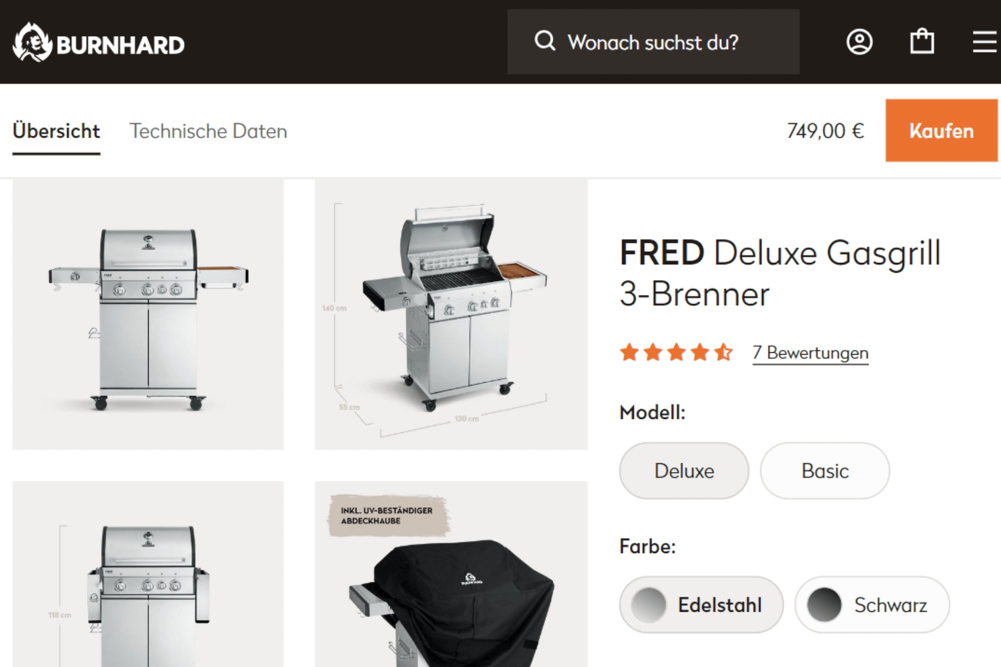
The product descriptions of the BURNHARD BBQs melt your buyer's hearts. They offer complete information, a lot of technical specs, comparisons to other products, and answer the following questions:
- Who is the product for?
- What is the product used for?
- How does the product work?
- What sets it apart?
- Why should visitors purchase the product?
Bogdan (Frontend Developer): "At Code, we’re especially proud of the performance of the product pages. The complexity of BURNHARD’s grills, smokers and pizzaovens required a lot of metafields and metaobjects on the PDP, where customers can check a variety of technical specs. I thought it was a fun challenge. There were so many product details placed in tabs, pop ups and comparison tables - it was like solving a puzzle to make it user-friendly and enhance the shopping experience. All these specs are taken from BURNHARD’s PIM system and ERP, Microsoft Dynamics Business Central. Even with all this content, the pages are nice and fast to load: we clocked a 7% increase of page speed on desktop, and an impressive 50% increase on mobile!"

.png?width=2000&name=vergelijken%20(1).png)
4. Create urgency / FOMO
Scarcity sells – it's a psychological fact that e-commerce brands leverage to their advantage. By creating a sense of urgency around your products, you tap into your customers' fear of missing out (FOMO) and nudge them closer to making that purchase.
Sabine (frontend developer): "Whether it's a limited-time offer or a product that sells out fast, make sure your customers know that time is of the essence."
5. Compare prices
Provide a comparison of the actual price and any discounted price in both numbers and percentages. Even if discounts aren't currently being offered, displaying potential savings (such as free shipping) can entice customers to purchase.
Frontend developer Roy adds: "To cater to an international audience, provide the option to view prices in different currencies, which can be easily implemented using Shopify Markets. When deciding where to place the price on the product detail page (PDP), strategically place it before or after the fold based on your audience's preferences and your page layout."
.png?width=2000&name=PDP-5-new%20(1).png)
6. Add trust badges and customer reviews
In a world where online fraud is on the rise, e-commerce websites must establish credibility and trust with their customers. Adding a small message of guarantee, highlighting social media mentions, and displaying safety logos or trust seals can boost conversions and customer confidence in your online business.
Project Manager Marloes advises against deleting bad reviews. Instead, respond to them, address the issue, and demonstrate to your audience that you value their feedback. The German skincare brand Santaverde includes a filter to arrange reviews from most recent to oldest or from positive to negative. Encourage customers to post a review afterward, for example, by sending a simple link via Klaviyo SMS.
.png)
.png)
7. Be transparent about shipping and stock information
If you are running low on stock, don’t wait till the check-out page to break this news to the customer. Your product page should correctly inform the visitor if the product is available. When the “Not-in-stock” information is out there in the open, visitors have the choice to move on and look for alternatives or leave their email behind. As with shipping information, inform them how long it will take to arrive at their door and how much the shipping costs.
8. Make the size selector user-friendly
Regarding online shopping, one size does not fit all. Size is one of the major deciding factors for anyone who visits your online store to make a purchase.
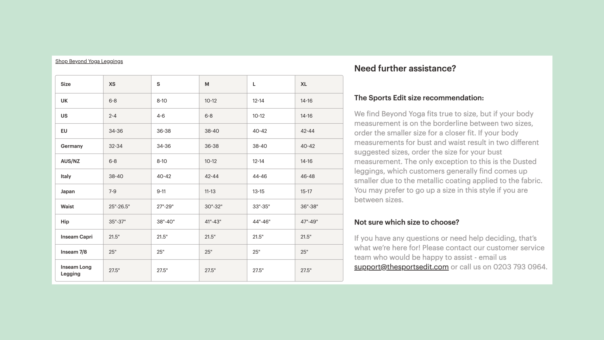
Sabine (frontend developer) advises making life easier for your customers by offering a user-friendly size selector and a comprehensive size guide, like The Sports Edit does. On their store, you will find a size guide that provides measurements in inches and centimeters, along with a size recommendation that indicates whether the product fits loose or tight.

9. Show related products
Help your customers find products that match the ones they are looking for. Use smart algorithms (like Rebuy or Nosto) to suggest related products that complement their current selection, making it easy for them to add to their cart. This will improve the browsing experience and also aid in product exploration.
10. Enable live chat
Have you ensured that your product page is as user-friendly as possible, answering all frequently asked questions and leaving nothing to the imagination of your users? When it comes to customer service, there's no harm in investing in a live chat feature. Gorgias, the #1 e-commerce helpdesk for Shopify merchants, makes this easy to implement. They proactively offer customer service by guiding customers through their purchasing choices via a live chat. What not to like!
Sabine (frontend developer): "Give your customers the opportunity to ask questions, voice concerns, and get real-time support without ever leaving your PDP."
.png)
.png)
So, what’s next?
By incorporating these 10 essential ingredients into your product detail pages (PDPs), you can elevate the shopping experience for your customers, drive conversions, and achieve greater success in the e-commerce landscape. At Code, we helped brands like BURNHARD, Stoov, and namuk to create a driving PDP.
Would you like help improving your product pages? Get in touch by filling out our contact form!


.png)