On February 13th Shopify followed this up with a memo to all Shopify Plus merchants, explaining they needed to take action before August 13th 2024 to ensure a smooth transition. To explain what action is needed from you, and to help you understand the possibilities of the new Shopify Checkout, we decided to sit down with our Lead Frontend Developer Melvin and our CCO Bob, and have them explain the details. Let’s dive in!
Major change #1: One-page checkout
The all-new, one-page checkout to all users which was announced during the Winter 2023 Editions is now live! It will replace the current three-page checkout you are familiar with, where customers click through separate pages to fill out personal data, select shipping details, and pay for their order. The new checkout will have fewer fields to fill out, and only one page to load instead of several, which makes the buying process way shorter and faster for your buyers.
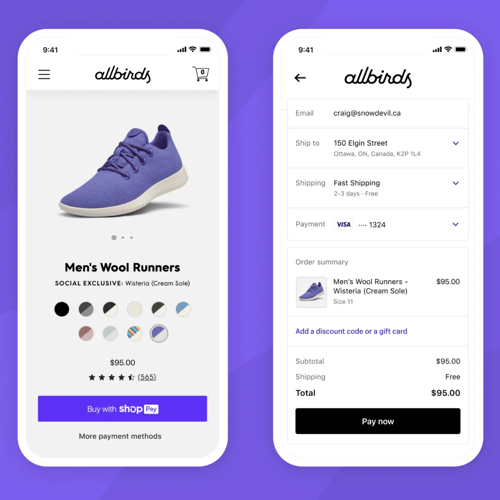
This one-page checkout is designed to bring the overall checkout experience as close as possible to the seamless identity-driven checkouts offered by the likes of Shop Pay. It will be able to recognize buyer information on pre-checkout touchpoints like storefronts or social media and handle these partially known buyer cases by pre-filling in details. Super handy if you ask us!
How to get started today
Your checkout will be auto-updated to the new design if you are on the Basic, Shopify, and Advanced plans. For Plus merchants, if you’ve upgraded to checkout extensibility, you will see the new one-page layout in your checkout editor. Simply go through the following steps to start using the one-page checkout:
From your Shopify admin, go to Settings > Checkout.
- In the Checkout customization section, Create a draft checkout, or Customize an existing one.
- Once you’re in your checkout editor, click on the Settings icon in the far left column. Scroll down, and you will see the layout switcher at the bottom left corner.
- You can easily preview the one-page design and switch between the two layouts here. All your customizations and extensions will integrate seamlessly.
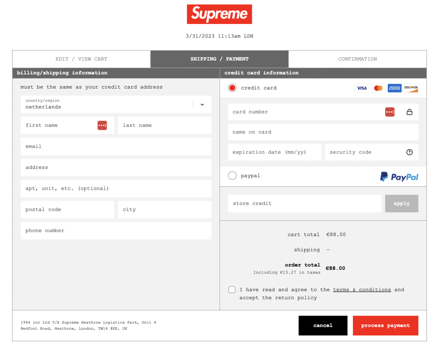
Inspired by Shop Pay’s conversion rates
Why is Shopify making this move? Because the faster, more friction-free your checkout, the higher your conversion - as Shopify saw confirmed once again with the results of their Shop Pay checkout. Customers who have a Shop Pay account enter their personal and payment details once, and from then on only have to confirm their online purchases with a five-digit code.
→ Want to know more about Shop Pay? Jump to the bit where we explain it!
Since the launch of Shop Pay, Shopify discovered that this express checkout has an impressive checkout-to-order rate compared to the standard checkout. Conversion on Shop Pay is 1.56x times higher on desktop, and an incredible 1.91x higher on mobile - reason enough for Shopify to streamline their standard checkout as well.
The importance of a good checkout
We don’t need to tell you that your checkout is arguably the most important bit of your entire online store. This is where conversion has to happen, or your business will suffer the consequences. As our CCO Bob likes to say: “You can build the most incredibly expensive product configurator, spend a fortune on branding or acquisition campaigns - but if your checkout is broken, you will still not make a healthy revenue.”
What keeps people from completing a checkout after having gone through the trouble of selecting products and adding them to their cart? The Baymard Institute, a UX research firm, has published a diagram showing the most common reasons:
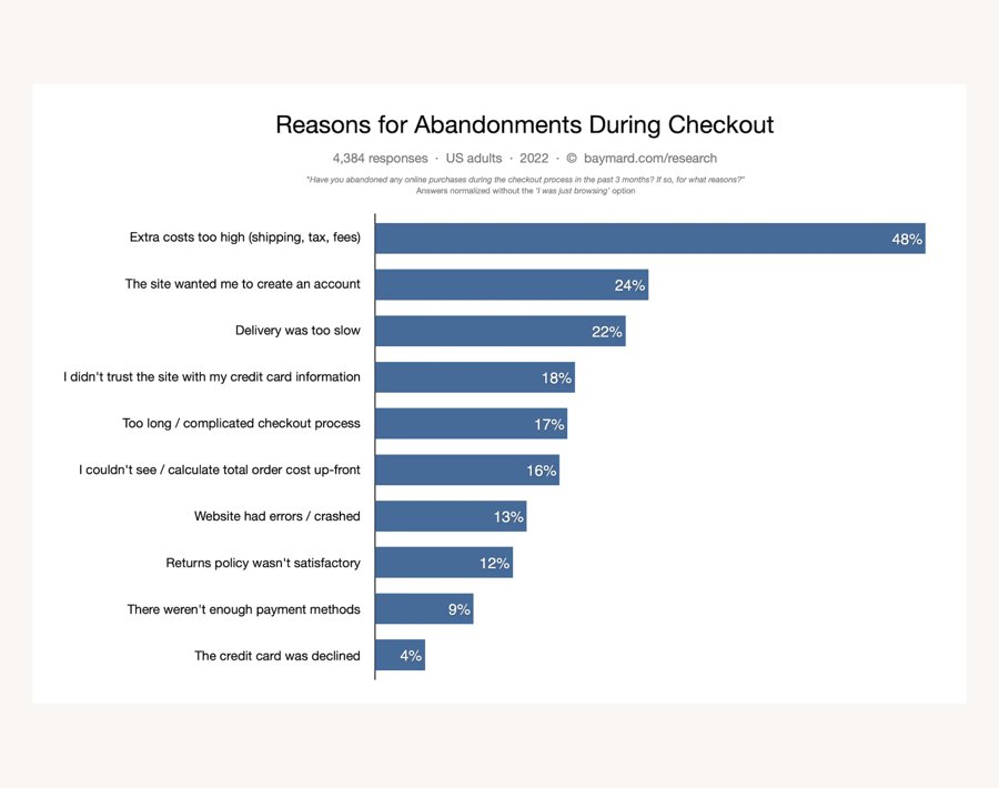
As you can see, a too long or too complicated checkout process is the fifth most common reason for people to abandon their purchase plans. This is where Shopify’s one-page checkout might make a noticeable difference for your store’s conversion rate, and give the platform and its users yet another competitive edge.
Major change #2: Drag & drop checkout editor for Shopify Plus
The other major change announced at the Winter 2023 Editions has been much anticipated by merchants for years: a straightforward, code-free way to make adjustments to the checkout. Hence, Shopify’s new drag & drop checkout editor is a total game changer - for both the platform itself and Shopify agencies like Code building on the platform. To understand how much of a game changer, allow us to give you a bit of background information.
Customizing Shopify’s old checkout
Shopify has always kept a close watch on their checkout. As the most precious bit of the whole platform, arguably the thing most of Shopify’s global success is built on, Shopify has a vested interest in keeping firm control over it to ensure its security and stability. Hence, they aren’t too keen to have all and sundry tinker with the source code. And with good reason, as an incident with Google Tag Manager illustrated last year.
As a result, up until now merchants have had little room to add or change anything in the checkout - things like branding, conversion-boosting microcopy, or cross-selling content - which has resulted in the Shopify checkout being very recognizable (and practically synonymous with trustworthiness), but also very uniform across stores.
The only way to make changes to the Shopify checkout - until now that is - was to have a Shopify Plus account and hire a Shopify Premier partner like Code to add a few strategically placed bits of code to the checkout.liquid theme file, and to update these custom additions with every new Shopify checkout update. This usually meant a lot of tedious work: Code had a list of the checkout changes we made for a client, Shopify would send us a list of what they changed and how it would affect our custom changes, and then we would go through those one by one and adjust our custom Liquid/JavaScript/CSS code to work with the new update.
Customizing Shopify’s new checkout
All that will soon be a thing of the past, because Shopify has engineered a way to bridge the gap between merchants’ wish for a more flexible checkout, and the platform’s need for a stable, secure, closed off checkout. How exactly?
-
On the one hand they are closing off the checkout’s backend by no longer allowing merchants and agencies to make changes to the checkout.liquid theme file, as of 13 August 2024.
-
And to compensate for this, they are handing Shopify Plus merchants and agencies Checkout Extensibility: a number of tools to go crazy with the checkout’s customer-facing layout - without compromising the stability of its functional core.
We think it’s a brilliant move. But it does come with a transition period, since there are quite a few Plus merchants who currently have custom functionality coded into their checkout.liquid theme file. Which they will have to rebuild using the new tools Shopify is offering, because as of 13 August 2024 any customizations in your current checkout will no longer work.
So before you press that new button marked ‘Create draft checkout’ in your admin, you need to do some preparation. Most likely in collaboration with your Shopify Plus agency. This is in a nutshell what Shopify’s email on February 13th was about.
How to customize your checkout using Checkout Extensibility
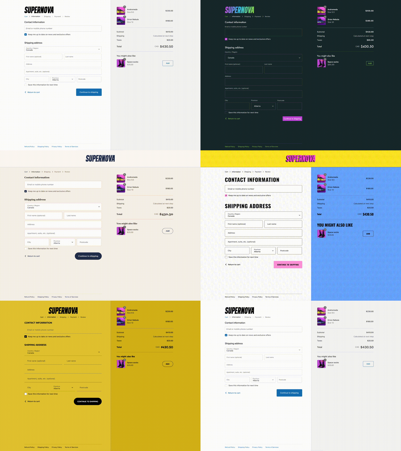
So what are your options as a Plus merchant? As Lead Frontend Developer Melvin explains: “Basically, you will have to overhaul your current checkout adjustments. Remove them from the checkout.liquid theme file and build them anew using the tools available in Checkout Extensibility. And when I say ‘you’, I actually mean: your Shopify agency, because most of the tools need experienced developers to set it up for you. Before it becomes no-code for the merchant, they will need Code to prepare the ground.”
It works pretty much the same as with the sections in a Shopify theme. Melvin: “After Code is done developing the bits and pieces, you as a client only have to place the extensions anywhere in the checkout where you want to use them. If you want to use them, that is - because you can just as easily remove them again.”
The code-free bit for merchants is the drag & drop checkout editor, found under Settings > Checkout > Checkout customization. This is where you play around with all the components, apps and extensions you acquire to customize your checkout. Before you can start playing, though, you will have to acquire those individual components - either by having your agency build or implement them for you, or installing them from the Shopify App Store.
So what components are available, and what can they do? Here’s a list:
-
Checkout UI Extensions. These are components (basically tiny apps) you can have your Shopify agency build for you and then install using the Checkout editor. Think of extra fields for the customer to fill out, in addition to the static fields that are always there. App developers can also create public UI Extensions, in which case you can download them from the App Store.
-
A collection of checkout apps. The Shopify App Store already has a number of checkout apps available to add extra functionality to the checkout. This collection will expand quickly over the coming year, as app developers start to build public apps and extensions for the new checkout.
-
Checkout branding API (to be released). You can have your Shopify agency set up your branding rules in an API once, and apply them to all checkout components (and future additions) with one click.
-
Shopify Functions. There is still a (heavily guarded) way into the checkout’s backend, and it’s called Shopify Functions. Have your Shopify Plus agency add custom code in the form of public or custom apps - without the risk of compromising your checkout. If there is a conflict with Shopify’s core, your custom code will simply not work.
-
Web Pixel Extension API. The pixel manager is a new section in the Shopify admin where merchants can add and manage pixels to track customer behaviour across their site. This is also where you can integrate any checkout tracking scripts like Google Tag Manager into the checkout. These scripts used to be added to the Liquid theme file, and will cease to work after 13 August 2024.
Things to do with the new Checkout editor
Now that your checkout is becoming much more flexible, what additions could you make? At Code, we have implemented a lot of custom features in our clients’ checkouts over the years. Here are a few that our clients liked in the past:
-
A BFCM banner with a message that shipping times are longer
-
A field where business clients can enter their VAT number
-
A field where customers can enter extra information on delivery, for instance that the package may be handed over to a neighbor
-
An address validation field: does the address exist? This prevents deliveries to non-existent addresses
-
A note explaining you don’t deliver to postal boxes because of fraude-sensitivity
-
Adjust payment methods to the chosen shipping method: with a pickup customers can pay in person or by card, with a delivery you offer all payment methods
-
The option to add a donation with a payment
-
An age-check (if you sell alcoholic beverages)
-
The option to add text for a handwritten note with a delivery
-
Your brand’s USP
-
Upselling content
-
A checkbox to add a free gift to an order
But you will have lots of new options as well. Bob: “We predict a lot more creativity in Shopify checkouts in the future, as merchants and app developers are catching on. You can even set up different versions of your checkout and temporarily switch to another one, for instance at Black Friday or another special occasion." At Code we look forward to seeing what our clients come up with!
→These are 5 ways Plus merchants customized their Shopify checkout
.png?width=900&height=595&name=Screenshot_2023-03-30_at_08.45.42_(2).png)
Why Code loves working with the new checkout editor
At Code we’re quite happy with the new Checkout Editor. Shopify gave us early access to test it with two of our clients, and we’re definitely fans! Bob: “In the past we sometimes had to tell clients that something they wanted for the checkout was simply not possible. Now there are vastly more options, so we won’t have to say no as often. We also like that these new extensions will be native, so they load a lot faster and can’t break down as easily. It’s no longer possible to generate JavaScript errors that will disrupt your checkout: now, if there is something wrong your extension will simply not work.”
From a frontender perspective, the new checkout is also exciting to work with. Melvin: “This is really fun for developers! It’s a whole new challenge for frontend developers working with Shopify, using React. At the same time it’s pretty foolproof: because the new checkout is very well protected you can work on additions without having to fear a breakdown if you make a mistake. With Liquid, if you did something wrong there were consequences. If you really messed up you could make it impossible for customers to complete the checkout, even.”
All in all, at Code we think the new checkout is a big step forward. Melvin: “Especially now that many Plus clients are using Shopify 2.0. Their sites have become a lot faster with 2.0, but their checkouts were still as slow as before. Now the checkout can keep up as well!” Bob adds: “And just as with Shopify 2.0, clients won’t need us anymore for layout changes, they can do more in-house. We’re really curious to see how clients will use the new checkout.”
And finally: signed-in shopping with Shop Pay
The third checkout announcement in the Winter Editions 2023 had to do with Shop Pay: customers can now use their Shop Pay account to complete a checkout. Clicking the button ‘Buy with Shop Pay’ leads them to their Shop app, where they can complete the checkout in an instant by entering a five-digit verification code. Because the app has their checkout data stored, they won’t have to fill out any fields anymore - making the Shop Pay checkout extremely easy to use and as friction-free as it gets.
This relatively new Shopify feature has only just been rolled out to the Netherlands, but it has huge promise. Some of our clients already have Shop Pay enabled and see the results - but we also hear that Dutch customers get confused using the app. Looking for the iDeal payment method and discovering that iDeal isn’t available in Shop (yet), they don’t know how to leave the Shop checkout and go back to the online store’s checkout.
Shop Pay is coupled to the Shop app, which customers can use to do all their online shopping in one place: search for products and order them in the app, and pay using the express checkout of Shop Pay. The app only lists products of merchants who have Shop enabled, whether they are on Shopify or not - so this might be an interesting extra sales channel for brands.
Shop and Shop Pay are still relatively new on the Dutch scene, but this form of shopping has a lot of potential. Want to know more about it? Get in touch, we’d love to help you with setting up Shop Pay!
Research says: Shopify Checkout is the best-converting in the world
Shopify partnered with a major global management consulting firm, providing them with comprehensive data and requesting a thorough analysis of checkouts across various commerce platforms worldwide. Regardless of the findings, Shopify committed to publicly sharing the results of the study.
After an independent examination spanning several months, the consulting company discovered that Shopify's overall conversion rate surpasses competitors by up to 36%, with an average lead of 15%. The study also revealed the significant impact of Shop Pay, Shopify's accelerated checkout solution, which can elevate conversion rates by 50% compared to guest checkout and outperform other accelerated checkouts by at least 10%. Even the mere presence of Shop Pay can enhance lower funnel conversion by 5%, as per the study's findings.
Want to build your new checkout? Partner up with Code!
At Code we already sent our clients an email inviting them to start work on overhauling their checkout from checkout.liquid to Checkout Extensibility. Are you looking for an experienced Shopify Partner to help you out as well? Look no further: Code has got you covered.
Fill out our contact form and schedule a free meeting with us to discuss your options!
.webp?width=930&name=checkcheck%20(1).webp)
.webp)

