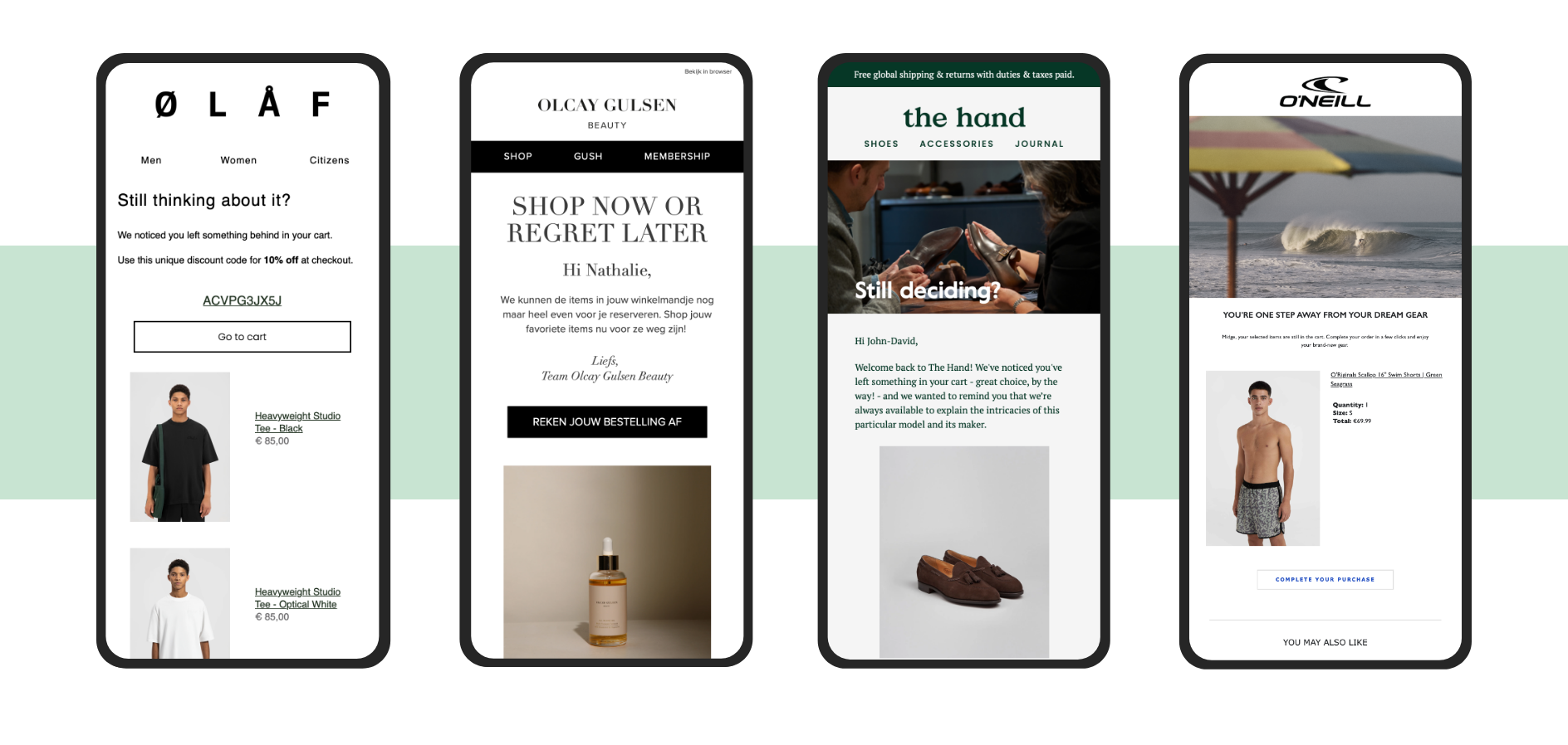
Our Abandoned Checkout Flows look like this
Mail 1: We saved your checkout for you!
Timing: Around 2-4 hours after checkout is abandoned, but it depends. Adjust the time before you send an abandoned checkout reminder to your average order value. People buying a bike probably need more time to think through their (rather big) purchase, so make sure your email arrives not too fast after they leave your site (2-4 hours later). When they abandoned two packs of coffee you don’t need to wait that long.
The first email in this flow is all about service. Basically, you tell the customer: We noticed you didn’t finish the checkout process, we assume you would still like to (hence we saved your checkout for you in case you want to finish the process), and do you need help by any chance?
Always have two different versions of this email: one for existing customers and one for first-time visitors. They are at different points in their customer journey and, therefore, need a different approach. New customers typically need more time to decide on a purchase, while existing customers already know and trust your brand. Build trust with a new customer by highlighting your USPs and your customer service and by being extra helpful.
Whether you send it to a new or existing customer, though, make this email primarily about the products that were left in the checkout. Show images of the products (this can be A/B tested, sometimes it works better with price, sometimes without) and make sure those are the only images in the whole email. No branded header image here! In addition, have a big button with a CTA like ‘Go to checkout’. When the customer clicks it, they should return to where they left off in the checkout process (Klaviyo has this feature! Very useful), so they don’t have to go through all the steps again. Note this, on lengthy checkouts with several products, we would advise adding one CTA on top and one at the bottom of the product block. This way you avoid that your CTA is being pushed out of your screen.
Finally: Use the subscriber’s first name to personalize the email, and always show them you are available to help. Put your contact details somewhere visible, so they know where to go when they need you. You could take it next level by thinking about how you can use other data from your consumer to personalize 'Hey Peter, are you exploring Amsterdam next week on your brand new bike?'

Mail 2, variant A: Here’s a discount code (For new customers)
Timing: 24 hours after email 1. This is most likely the time of day when this customer is online shopping.
Following up on the first email when people didn’t return to your checkout takes some thinking. First, you have to decide how many times you want to remind people of their abandoned checkout: too many reminders might be perceived as pushy, so at Code, we usually limit ourselves to two. Monitor your flow throughout time. If your unsubscribe and spam rates allow, you can extend with more emails.
Second, there is this to consider: seasoned online shoppers might abandon checkouts simply to see if you’re going to reward them with a discount code. We advise doing that only with first-time customers: to get them over their barrier, offering a discount code for free shipping usually works. Free shipping is a fixed sum and is quite neutral, but if you offer a discount on products you have to decide what suits your brand and product best: a percentage or a fixed sum? Intuitively, a fixed amount is a better fit for luxury products, and a percentage for the not-so-exclusive products.
Returning customers who abandoned the checkout receive a different follow-up email, without a discount code (see below).
As we mentioned above, new customers also need more introduction to your brand’s USPs and customer service. If your brand has a product quiz or other tool to help customers choose the right product for them, this email is a good place to introduce the tool as well. In addition, social proof and user-generated content should be used. Think about customer quotes, product reviews, or store reviews.
For some brands, the classic abandoned checkout emails don’t work. This is often the case with brands selling products that need to be experienced first-hand, like mattresses and bikes. Hence, getting people to visit these brands’ brick-and-mortar stores is key. In those cases, make the second email in the abandoned checkout flow all about inviting customers to book an appointment: to test-drive a bike or to test-sleep a mattress in one of their stores.
Mail 2, variant B: Buy before it’s too late! (For existing customers)
Timing: 24 hours after Mail 1.
You do not want to train your customers to expect a reward every time they abandon your checkout, so have a different second email ready for returning customers. This one doesn’t have a discount code and can be a little more urgent in its message, something like: the product is very popular and about to be sold out, so hurry!
Mail 3: Do you need help?
Timing: 2 days after the customer left the checkout. Check unsubscribe rates and spam rates before rolling this out, though.
An optional third email in this flow might be a very service-oriented message in which you ask for feedback. Is there anything preventing the customer from buying? Did their payment not go through, were the credit card fees, shipping costs, or delivery times an obstacle? Would they be interested in filling out your product quiz to decide which product is the best fit for them? Does the customer need your help with technical difficulties, or is there something else not working well for them?
If you play your cards right, such an email might give you very valuable insights into the problems and obstacles people run into when they want to buy something from you. If a customer takes the time to reply to this email, make sure you offer them excellent service! There’s no happier customer than a customer you helped solve their problem, and if you exceed their expectations you might have found a true ambassador for your brand. Conversely, if you ask for feedback and don’t follow up on it, you just lost a customer forever... So only send this email if you are willing and able to do something with it.
Since this email feels quite personal to the receiver, consider leaving out the usual automated branding. A text-only message from jane@customerservice conveys to customers that your brand is actively seeking their input, which will make them more inclined to reply.
Implement your abandoned checkout recovery flow
Ready to turn those lost sales into wins? Implementing an effective abandoned checkout recovery flow can be a game-changer for your business. You can find more information about the 5 must-have flows here, or take a look at our inspiration book. At Code, we would love to help you improve. Reach out to our team here.

-min%20(1).jpg?height=2000&name=Code_240516_Alyssa%20van%20Heyst_13%20(2)-min%20(1).jpg)


